Does The Apple Watch Display Really Need All That Data Density?
When Apple Watch was first announced with its emphasis on fitness tracking (which remains the most well-deserved part of the hype surrounding the thing since launch, as it’s easily the best, most convenient such device I’ve ever owned), we — and everyone, really — mused that Fitbit was in for a world of hurt. Admittedly, some of that was tempered by fundamental disparities in price point, but even Fitbit launched a preemptive IPO in order to quickly raise over $700 million for its Apple Watch “defense fund.” Right now, though, such a fund seems hardly necessary.
Though this could change in time as Apple Watch grows in popularity and shrinks in base price, there’s another possibility that should be taken at least somewhat seriously. And to my delight, it’s actually one that I’d (at least in part) soundly rejected in the past: Perhaps instead of its apps, Apple Watch itself could be streamlined down to its core essence. That is, perhaps it could simply be a complex sensor suite, forgoing the heavy touchscreen reliance and Digital Crown input that currently define what it’s trying to be. Abdel and Julia both discussed this very thing at length over several podcasts, but I wasn’t a believer then. And I may not completely be one even now, but the approach is starting to make more sense.
With all the talk of data density and micro-displays and basic third-party app features and so forth, I’ve discovered lately that I really dont need or care about any of that. All I truly need out of my Apple Watch are notifications, heart rate monitoring, Taptic output, basic remote control functions, and actual time-telling. Yes, I want third-party Faces added to the feature set, but other than that, it seems to me that the most useful future of Cupertino’s wearable lies not in what it shows but in what it communicates.
That’s not necessarily the same thing, and losing that connection — or, rather, realizing that the marriage might be better served mostly severed — could let Apple Watch embrace its core competencies better than the current model affords.
That said, dont misunderstand me: I am not advocating getting rid of the Apple Watch touchscreen or its awesome Force Touch mechanism. However, I think the display could minimize its focus to showing users only immediately pertinent data (notifications, heart rate, time, music controls, weather, etc.). Nobody needs to read an email or news report on their wrist. Nobody needs in-depth stock market analysis or browsable photos there, either. Nor does the Apple Watch screen need to be square, because the above proposed minimalism lends itself to whatever shape — at whatever size — looks best. And i dont care what anyone says, that means round. Because the bottom line is simply this: Beyond the basics (and, another Abdel idea, “apps-as-Faces/Complications”), there’s nothing I need to see or do on such a small screen. Apple Watch will never lose its iPhone tether in the mainstream, so anything data dense will invariably be pushed through to and consumed on that bigger screen.
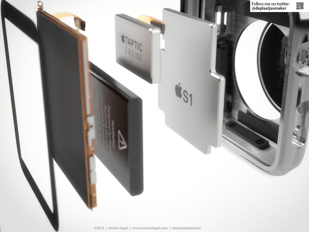
All Apple Watch needs to be is a glorified fitness/communication band. Yes, it still needs an OLED display, for as interesting and appealing as Pebble’s e-ink solution is, that’s just not Apple’s style. Yes, it still needs to have a Force Touch layer. But what it really needs are internal upgrades. Apple Watch needs a better, more versatile (and directional!) Taptic Engine, a rear sensor array capable of deep health monitoring, and a more gesture-heavy control setup using its advanced accelerometer and gyroscope chipset. What the thing doesn’t need is its convoluted app constellation and navigation system, as all those serve to do is slow the wearable down to the point of frustration.
We’ve spent so long talking about how third-party developers need to distill their offerings for the small screen. That, it turns out, is a philosophical mistake. To be truly remarkable, Watch Apps have to be uniquely suited to the wrist, not redundant to the bigger screen in your pocket. But more than that, Apple itself needs to do what we thought all those devs had to: Apple has to look at Apple Watch as a sensor array and focus not on displayed data density but on useful data collection.
The way the Fitness Watch App works should be the way every Watch App works.
And that means that the current Apple Watch package could change considerably in design, price, and impact going forward.
Here’s hoping.