The Round Apple Watch That Should Have Been
Most of the Apple pundits and aficionados out there (of which I am occasionally one) all seem to agree that the company made the right decision going with a rectangular chassis and screen for Apple Watch. And from nearly every non-fashion standpoint, Apple was absolutely correct to take the angles they took. A rectangular device maximizes both screen real estate and internal component space. Battery life benefits perhaps the most out of this arrangement, and the overall package is one that looks very much like everyone expected an Apple smartwatch to look:

But I do agree with many Apple critics and Android Wearriors when they say a circular build makes for a more immediately attractive and alluring smartwatch presentation, even though that’s predicated on a bunch of outdated and outmoded necessities. A round shape for a smartwatch is entirely arbitrary when the digital concept is essentially starting from scratch. I get that.
But smartwatches aren’t really starting from scratch.
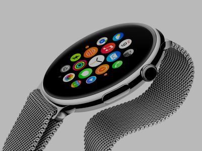
Interestingly, Apple itself seems to agree at least in part, as the Apple Watch UI toes the line — quite unnecessarily — between square and round. And those round elements, like the app icons, Glance achors, friends dial, activity meter, half of the Faces, etc. all speak to the fact that Apple understands the importance of the circle to the past, present, and future of wristwatch and smartwatch alike. Indeed, most of the Apple Watch UI’s Glances and Force Touch options would all look just as at home (if not even cozier) on a circular screen. Check out the round battery meter hiding in the corner of that empty rectangle. Ditto for the heart rate Glance and countless others. As for the aforementioned Force Touch menu, there’s never more than four of them, and a circle splits up nicely into even quadrants. Even a few of the non-round stock Faces, like Astronomy and Solar, would make more sense spinning around on a circular screen. The only real puzzle to solve falls to stacked option menus and text-filled emails, and the current scrolling solution — while maybe a mite inefficient — would be doable enough.
Unfortunately, Apple didn’t do enough, and I don’t believe that the above awkward dichotomy actually works very well. I’m not particularly enthralled by the Apple wearable’s rounder elements in light of the company’s vehement insistence on breaking with such tradition for the most visible aspect of the entire device. Why should a pixel-maximizing rectangular display be filled with so many pixel-minimizing circular design elements?
And it’s not just the software, either — This applies to the hardware, too. Why is the heart rate monitor a perfect, beautiful circle (with four perfect, beautiful circles inside it)? Why does the Sport Band feature a rounded bump and a round peg for a series of round holes? Why should the Digital Crown embrace the “irrelevant” wristwatch past when it could be improved upon dramatically within Apple’s chosen parameters? The input mechanism, as it is today, makes a lot more sense applied to round cases than rectangular ones, as the rectangle’s bezel and side-panel opportunities — which don’t exist on a rounded chassis (no matter how hard Samsung tries) — are not utilized on Apple Watch. This is a clear example of form over function, and it’s a clearer admission that the tenets of “round” still apply in Apple’s mind.
Ultimately, the above seems to derive from one of two things on Apple’s end. These elements are either a needless, Ive-insisted series of half-baked homages, or they’re just a lazy realization of some desire to differentiate from iOS in a blatant-to-the-consumer, “Look, I’m something new!” kind of way (as if Apple Watch wasn’t obviously different enough in the first place). Realistically, it’s probably a little bit of both. And in the case of Apple’s design chief specifically, it’s more than a little bit ironic. Ive has gone on record declaring that, for smartwatches, “a circle doesn’t make any sense.” Even more than that, he’s famously outspoken in his disdain for skeuomorphism on the digital plane. Yet he’s filled his grandest, most personal pet project with tons of skeuomorphic circles. Somewhere, Scott Forstall is smiling. Or crying.
Clearly, the easiest fix — and my pragmatic druthers in the here and now — is for Apple to shore up its wearable’s UI with more squared elements and a better home screen solution that isn’t so distractingly dynamic. I don’t mind the lack of labels (because small screen), but I do think the constellation is another cue born of form over function (and/or different for the sake of different), and I avoid using it as often as possible — which is maybe the entire point of the thing to begin with, as Apple seems to be positioning its Glance system as the primary app launcher for Apple Watch.
Regardless of Apple’s motivations, however, I’d be more interested in approaches like this, where Apple Watch might utilize a columnar solution akin to the classic iOS layout. (Plus, you know, squared icons provide for generally more forgiving tap-targets, which should be a major consideration for screens so small.) As I told Mark over on his blog, organizing the Apple Watch honeycomb — for me — was (and remains) a frustrating affair fraught with far more abandonment than any semblance of success. It’s a disappointing, frustrating, wonky experience. But it’s one that’s wholly fixable through software alone. And while I’m not sure how the Apple Watch UI will evolve over time, I won’t be surprised to see more squared elements fill that nice squared screen.
As for that squared screen, fans of the thing should rest easy: There is no doubt that the Apple Watch form factor itself remains a mainstay. And it should, as the technological advantages it harbors are seemingly non-negotiable.
But I wish Apple had negotiated them anyway.
I wish Apple’s design team, led by Ive and newcomer Marc Newson (who I think is more professionally interesting than Ive by almost every meaningful metric), had figured out a clever way to make a circular smartwatch actually make sense for the end user.
Yeah, I kind of wish Apple Watch was round.
While I could pretend that this comes from an aesthetic, style-minded desire on my part, it really doesn’t. Sure, I think round wristwatches look better (I’d rather have a Rolex President than a JLC Reverso), and I think that, if Apple were going to borrow so heavily from Newson’s portfolio anyways, they should’ve gone ahead and aped his Ikepod masterpieces, too (albeit making them quite a lot slimmer). But much more than that, I think that Apple Watch — as a foregone blockbuster and market-leader conclusion — could have used its unquestioned clout to beat the preempting Android Wear at its own game. Apple Watch would have been a far more interesting device had it gone this route, and its summary successes there — i.e. keeping case size reasonable, keeping battery life at reliable all-day levels, and keeping the style-ometer amped all the way up to 10 (instead of the seven or eight where it sits today) — would have each been more impressive and more laudable than the very good, but very pedestrian, hardware job that Cupertino’s engineers put together with the Apple Watch we actually got. Plus, as a rectangle, Apple Watch can’t do this.
Now, I know what you’re going to say. I know that the old Apple Watch fallback — that pointiest of talking points — goes to the data efficiency of the rectangular display, that rounded screens have too much radial waste to be worth a darn for data-centric views of any and every non-timekeeping kind. And that’s a sound argument. I’ve made it myself several times. But Apple’s gone to great lengths with Apple Watch to underscore the importance of the minimalistic approach, imploring developers to reduce features and content to the barest of essentials, those sole necessary functions that relegate the rest of the iOS app experience to irrelevance at the wrist.
Here’s an illustration of every stock Apple Watch Glance compared against how it might look — largely unchanged from Apple’s own design language — on a rounded display (tap/click to enlarge):

Naturally, the above is not indicative of the designs Apple would have used for a circular screen. It’s merely a mockup demonstrating that, for the most part, every part of the Apple Watch UI is translatable to a round format without any data loss or reduction in data density. And in several cases, the rounded versions are easier to look at and provide for even faster data acquisition than the alternative. Granted these are only Glances, the concept applies to most of the rest of Apple Watch, too. The circle-filled home screen, for example, works just as well on a circular display, as would things like the Photo app (which, in my opinion, ought to be presented as a constellation, too, just to double down on trolling the trypophobics).
So with all that in mind, I think the square-versus-round argument re: pixel use falls a little flat. A good smartwatch UI, even by Apple’s own standards, should preclude all those considerations. Just because Android Wear’s format is monumentally wasteful, there’s no reason to think a truly concerted, all-product effort out of Cupertino couldn’t have produced a clever, compelling way to make a gorgeous round smartwatch. And there’s little doubt in my mind that had Apple’s finest followed that through, the interface would’ve been quite a lot more interesting and fun to look at (and use!) than the polished, half-iOSed theme the wearable offers on-board.
Instead, though, it feels like Apple caved to the unfounded idea that a solid — and even superior — circular UI is somehow impossible. Apple took the easy way out, and the company compromised in a way that feels very unnatural given its long hard-balling history. And while that conservatism is probably very good for business, it feels pretty darn lame to the likes of me. Worse, it just doesn’t feel like Apple. A rectangular Apple Watch — formed as it is exactly along the lines of a shrunken-down iPhone — seems like a single-minded, simple-minded cop-out.

That Apple didn’t come up with — or, more probably, that Apple couldn’t come up with — an attractive, usable, circular Apple Watch design is something of a letdown. It means that the company with the best people, the best resources, the most power, and the slickest supply chain couldn’t put out the product it probably wanted to produce from day one. But worse, it means that once the idea to go square hit home, Apple couldn’t even go all-in with that. When it comes to purity of design or purity of utility, you’ve got to sort out your values and pick one or the other. There’s no such premium place as “the best of both worlds.” That space is reserved for the middle ground, and the middle ground is always very, very boring.
I’m not sure I’ve ever seen a consumer device so exquisite and well-crafted as Apple Watch also be so fundamentally half-hearted. Or, at the very least, one that’s quite so dishonest in why and how it does what it does.
If Apple Watch should really be rectangular as Apple (and nearly everyone else) so firmly believes, I have only one request for Cupertino:
Prove it.