Why The Digital Crown Will Be A Thing Of The Past
I’ve taken a lot of guff from various Apple Watch pundits for my repeated assertions that the Digital Crown is a needless design cue — that it’s a complicated, delicate, unnecessary accoutrement included specifically to endear Apple Watch to a fashion crowd otherwise leery of smartwatches in general. Yes, Apple built this pointless nonsense for no other reason than to shed (or attempt to shed) the geeky, nerdy stigma that smartwatches have otherwise historically endured. To that end, it probably worked.
But in a generation or two, Apple Watch — despite repeated rumors to the contrary — will be established as a world leader and fashion icon, at which point any smartwatch stigma it may have initially carried will no longer apply. That’s when design purity and manufactory considerations must take over.
And ironically, that’s when Apple Watch — as the unchallenged smartwatch king — will actually lose its Crown.
Why?
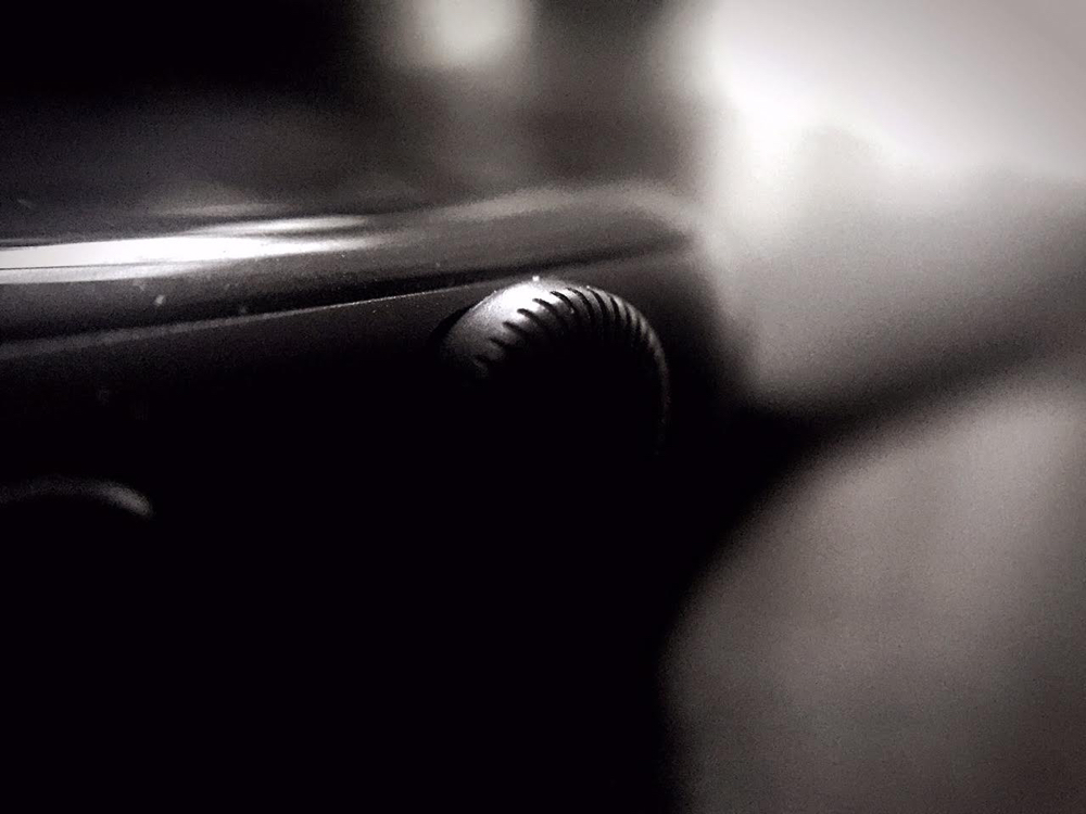
Because the simple reality is that it isn’t needed. It’s a complex moving part in a platform antithetical to hardware delicacy. The solid state has always been the mobile ideal, and we’ve always been moving towards it. Yet the Digital Crown rotates about a delicate spindle, gets gunked up through normal daily use, and — though tactile enough — is not even as responsive or useful as the cheaper, more durable alternative would be.
It’s not as responsive or useful as a touch panel.
Note, however, that I do not say “touch screen,” as I am not suggesting that the Digital Crown’s functions be replaced or reimagined for on-screen use. Rather, I am saying that there is ample space on (in?) the Apple Watch bezel to put a dedicated touch panel that would replicate the Digital Crown’s entire utility in the same way Apple’s Magic Mouse replicates the traditional click wheel. Better, this solution could actually improve upon the Digital Crown’s capabilities, enabling users to avoid repetitious scrolling via an edge-based “hold-to-scroll” function. Improved, more expansive inertial scrolling, too, would be a useful, delightfully “flicky” experience in this setup, and with Force Touch in tow, the actual “button” function of the Digital Crown can also be perfectly maintained. Indeed, instead of the current system’s requirement of two distinct, rapid presses for switching to the last-used app — or the “friends” button needing two presses to initiate Apple Pay, as this concept assumes the deprecation of that button’s use entirely — a firm press (as opposed to a softer one, which would replace the single press) could abolish those silly redundancies altogether.
And that’s what this is all about: replacing redundancy.
The following illustrations should underscore what I mean.
First, here’s how the current Digital Crown system works, with all its most obvious shortcomings listed for quick reference:

But everything — everything! — the Digital Crown actually does can be done by simpler, better, more forward-thinking available technology. Think: When you interact with your Apple Watch’s little wheel, does your finger generally brush the bezel as you spin it back and forth? If so, that Digital Crown is 100-percent technologically redundant. Take this alternative, which uses the aforementioned touch bezel to achieve the same exact effect via the same exact motion you already employ:

And if Apple is still beholden to buttons and not quite ready to ditch them altogether (because of production roadmaps and planned obsolescence, which is understandable), this solution — using a centered, elongated, touch-sensitive version of the pill-shaped “friends” button — would make an adequate stopgap while enjoying almost all of the advantages of the idea above:

All that said (and drawn), I suspect most readers will disagree. If you do, just ask yourself this fundamental question: From both a technological and manufactory standpoint, what does the Digital Crown do better or more efficiently than a Force Touch-enabled bezel (or button) could? Honestly, I can’t think of a single example.
But I do understand the rejection of this idea and how it seems to skew to the aesthetic. I get it. The Digital Crown’s cool. It melds the past with the future in an easily accessible, user-friendly way. It’s neat. And it’s perfectly okay to love the thing. It’s even okay to buy into how Apple sold it:
Apple Watch introduces a specially designed and engineered Digital Crown that provides an innovative way to scroll, zoom and navigate. The Digital Crown is Apple’s most revolutionary navigation tool since the iPod® Click Wheel and iPhone® Multi-Touch™.
But it’s also okay — and in fact, imperative — to remember how Apple sold the world on iPhone’s 3.5-inch screen as the perfect one-handed smartphone display and how the hordes of Apple aficionados and apologists vehemently agreed — until Apple said iPhone 5’s taller screen was even better. Of course, almost everyone agreed with that, too, just as they now agree that iPhone 6’s size is superior to both. Apple is in the habit of selling temporary perfection.
And the Digital Crown is just that: temporary.
Unfortunately, though, it’s far from perfect, and it’s an uncharacteristically regressive solution from a design guru who’s prided himself — over the course of his entire career — on the pursuit of elegant bare essentials. With the Digital Crown, Jony Ive traded a more simple, more useful, less expensive, and more durable existing technology for a needlessly costly, complicated, breakable bauble in the most overt example of form over function I’ve ever seen out of Cupertino. But even putting said form’s importance on the pedestal, it still failed.
Because there’s nothing magical about a clickable scroll wheel.
But a beautifully symmetrical slate that comes alive at a glance and moves fluidly with a touch along its glossy, smooth, unbroken chassis? That would be.
Steve Jobs’ dream for iPhone was to get rid of its buttons. That dream — along with Jobs’ legacy — is still alive at Apple, I think.
Cook and company would be fools not to heed it.