Does Samsung's Gear S2 Really Copy Apple Watch?
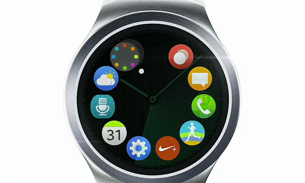
Last week, we got a sneak peek at the upcoming Samsung Gear S2 smartwatch, and the immediate reaction was that it “shamelessly imitates” Apple Watch on the UI front. Of course, Samsung does have a history of copying Apple’s hardware (and software icons), so this makes sense as a general reaction to the unveiling. But we haven’t really seen Samsung’s UI in action, nor do we know much else about the product, aside from what can be gleaned from this brief virtual promo:
In fact, there’s still some question as to whether or not the Gear S2 is the rumored, bezel-controlled Gear A (formerly dubbed “Orbis”). And while the above video seems to indicate that the S2 will indeed feature some sort of bezel control mechanism, there’s still no indication that this is the previously leaked flagship. Samsung, after all, is not a “one product at a time” kind of company, so it’s entirely possible that its Orbis concept is coming to all of its future smartwatches, with the S2 being the budget device in a line of Tizen-running Samsung wearables.
Initially, I’d expected the Gear A to have a physically rotating bezel, providing tactile feedback and perhaps even featuring a “spring back to zero” resetting toggle. However, the S2 doesn’t appear to have such a bezel at all. Instead, the slick silver frame looks more like a capacitive touch controller akin to those used on older iPods, reflecting what I think should become of Apple Watch’s own Digital Crown. After all, moving parts don’t typically play well with mobile durability. Still, I was hoping for something a little more premium-looking out of the Gear A, so I like to think that the S2 is the more reasonable, toned-down, pragmatic sequel to the absurdly bulky and nerdy Gear S while the Gear A is going to be a wholly different beast — with a luxury build and a price to match Apple Watch. (For what it’s worth, this apparently official mockup of the Gear A’s fancy watch face is nowhere to be found in the current S2 marketing materials.)
All that aside, the biggest news here — to the mainstream tech world, anyway — is the old “copycat” debate. For the most part these last several years, Samsung has paid legally-tenuous homage to Apple’s industrial design, so this is a natural argument now that both companies are firmly in the wearables space. Of course, Samsung smartwatches do not take any external hardware design cues from Apple Watch, marking a rare reroute from their usual MO. In reality, most folks seem to be clamoring only about the S2’s circular icons. To me, that’s a forensics no-go. The fact that Samsung’s round smartwatch uses round icons is more practical and logical than Apple Watch using the same, and it would make zero sense for the Korean company to use square icons on their circular display.
Criticizing this particular design choice, then, is disingenuous at best. Now, if Samsung ends up using a spherical constellation of apps as its home screen the way Apple Watch (inappropriately) does, critics might have a case, but right now it just looks like the Gear S2 UI is built around the general concept of points on a dial — kind of like every wristwatch ever. Believe me, I’m quick to call a clone a clone when I see it, and the Gear S2 — from what little we’ve been shown so far — hardly qualifies. If anything, the thing’s interface more closely resembles the webOS-running LG Watch Urbane LTE.
Whether or not the Gear S2 is Samsung’s erstwhile Orbis, I’m still eager to see it in action. As I’ve said before, a round UI is possible, and I’d love for somebody to finally get it right. It might not be enough to make me switch to Samsung, but the Orbis and the Edge could make an awfully compelling combination.