Going Around In Circles
A few weeks ago, I wrote about how Apple Watch — a seeming triumphant melding of industrial and fashion design — was a bit half-hearted about what it really wanted to be. It’s as if Apple’s head honchos — in this case Jony Ive and Marc Newson — couldn’t fully come to terms with the fact that a round smartwatch didn’t make much sense from a technological (read: “internal component”) standpoint. So they settled — yes, settled — on a square affair.
And then proceeded to fill it with as many circles as possible.
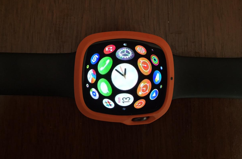
And while the home screen’s app icons are a good example of this, the way the actual app constellation moves is an even better one. Try it. Spin it around with your finger. To me, the spherical illusion is extremely strong. Even more than that, though, it’s just another aspect of Apple Watch that would have looked a heck of a lot better on a circular display. Indeed, the constellation seems designed from the ground up to fit inside a round case, not a rectangular one. And the more apps you have installed, the clearer this truth becomes. Check it out, and see if you agree:
One of these days, we’re going to get a glimpse at all the wearable’s early prototypes, and I’m really interested in seeing what those very first round Apple Watch variants looked like. Ah, what could have been!
Between now and then, though, I really hope Apple embraces their chosen platform and shores up its UI inconsistencies.
Because right now, Apple Watch is going around in circles when it’s hip to be square.
