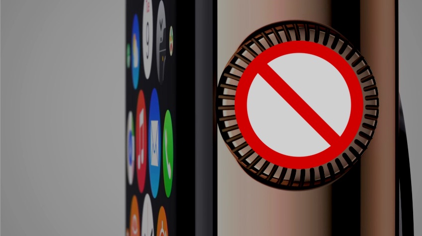
De-Crowning The Apple Watch
I think the Apple Watch could have existed with no Digital Crown at all. In a company so obsessed with removing buttons, the crown seems somewhat redundant. And the two home screen thing reminds me so much of the schizophrenic Windows 8 — modern and desktop modes — that it’s a little nightmare-inspiring.
What if — and go with me here — there weren’t two home screens? What if the watch face was simply the left most panel in a scroll, and the next panel was the circle of friends you get with the second button, and the third through n-th panels were just grids of nine app icons for all your apps. In that case, I don’t think you’d even need a crown, and it would make the UI much cleaner and easier to navigate.
You’d still be able to see your notifications by swiping down.
You’d still be able to see your glances by swiping up.
You’d just have left and right swiping too, to get to your people and your apps.
If the watch is off your wrist and locked, then it wouldn’t let you scroll past the first panel — the watch face.
Now, the crown is good for scrolling in and out on the map, and pinching on such a small screen is tough. To navigate around that, I think Apple could take a page from Samsung and introduce a “side-screen” along the right edge of the Watch that would simply act as a touch-enabled swipe-scroller to zoom in and out when such cases are needed. [Yup.]
This collection of UI changes would mean that the watch could have just one button — a home button if you will — that would take you back a) out of an app if you had one open, and b) back to the watch face (left-most position on the main scroll) if you were in the main scroller but not at the watch face.
Now, I’ll go back to my original statement about Apple being focused on removing buttons. My only thought is that they left the crown because they have something coming that is going to make the crown the star of the UI — some other use case that we haven’t envisioned yet. I guess we’ll see.
