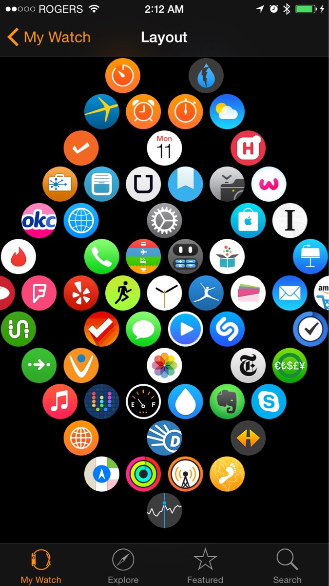
The Scientifically Best Way To Layout Your Apps on Apple Watch
Tired of trying to open an app and missing or opening a different app? Well, Reddit user frendargolargo believes he has found the scientifically best way to layout your apps for the highest chance of success when tapping them.

He using Fitt’s law, which according to WikiPedia is a “descriptive model of human movement” suggests that “the time required to rapidly move to a target area is a function of the ratio between the distance to the target and the width of the target.” Or has he more eloquently put it: “The best way to shorten interaction time on the app screen is give yourself more space for error.”
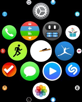
Given that app icons can be super small, giving yourself maximum space to tap them is going to help give you the highest chance of successfully taping and opening the app you have in mind. Here’s what it will look like on your Watch once successfully implemented:

As you can see, you essentially want to create “circles of apps” with space around the middle of every six apps. According to frendargolargo, this will give you the least amount of accidental taps.
If you’re someone who as a lot of apps installed or if you simply access apps often on your Watch, then you may want to give this a try.