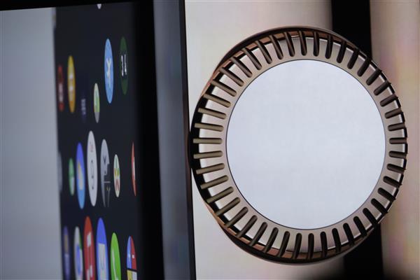
What Does The Digital Crown Do?
The digital crown doesn’t do much and may be totally overblown
When Tim Cook announced the Apple Watch, he placed great emphasis on the digital crown — the dial on the side — as a way of controlling the device. … The digital crown is to the Apple Watch what the scroll wheel was to the iPod or multi-touch was to the iPhone…
But designer Kevin suggests there’s a disparty between this and the access they currently have to the mechanism. “Apple spent a considerable amount of time featuring the digital crown as a revolutionary UI element, but again the SDK provides no methods for interacting with this element beyond a standard scroll.”
WatchKit will be slowly opened up to developers over time, just as iOS for iPhone, iPod, and iPad before it. As for the Digital Crown being overblown, how else are you going to operate a zoom on a screen so small? I’m a little more skeptical about scrolling, but I’ll need some hands-on time with Apple Watch to see if the wheel’s actually better, faster, or easier than repeatedly flicking my finger across the display. (I think it likely will be, given the constraints and repetition required of the latter method.)
However, if you really want to know why Apple spent so much focus on the Digital Crown, just ask the Wharton School of Business:
In contrast [to Google Glass’ approach], Apple designed Watch to look as similar to a traditional timepiece as possible, down to the round crown on the side. The crown is “comforting,” [management professor David] Hsu says. “A lot of times when companies introduce something new, they want to include a familiar component.”
Apple Watch has a crown because watches have crowns.
And so do kings.