Apps Are Not Apps
A few days ago, M.G. Siegler wrote a wonderful post entitled “A Tale Of Two Wearables” in which he describes how simple and carefree your life is at Disney World when you wear the theme park’s all-purpose “MagicBand.” In his piece, Siegler suggests that, one day, maybe Apple Watch will become the “MagicBand for real world.”
Ever since that post, my mind’s been swirling with ideas about how many things society could possibly replace if that were to actually happen. House keys, car keys, garage door remotes, gym membership cards, and about a billion other trivial-but-not-really things we take for granted right here and now. All these things — whatever they might be — could potentially be replaced by one thing right on my left wrist. How awesome would that be?
That’s when I realized something.
In an ideal world, none of these things would even require apps that you’d have to open. You simply walk up and boom! — whatever you were expecting to authenticate does so without any issue, just based on your physical presence and a learned pattern of expectation. IFTTT for the real world. There is no app for that.
What real benefit do I get from an app on my smartwatch when it tries to put a smartphone experience on my wrist? In watching the second Apple Watch presentation, you can see how terrible of an experience it is: When Kevin Lynch takes a moment to show us Instagram on the wearable, it literally takes him four taps to “like” a picture. This seems far more illogical and far less enjoyable than doing the same thing on my iPhone, and it’s a tedium that might make me forego that entire social aspect of Instagram out of sheer annoyance. If I have to tap-tap-tap-tap your marginally amusing photograph to show my marginally engaged approval, I’m just going to skip your snap altogether. And so the service itself suffers. Bad UX is a dealbreaker every time.
Which leads me to think: Are apps really the future of Apple Watch?
At this moment, I don’t feel that way. Instead, I see the future of Apple Watch as a product that demonstrates a masterful, seamless aptitude for authenticating our existence to corresponding terminals and locks. Sure, you may need an “app” with your login info to have some of that happen, but actually needing to expend any energy or attention interacting with it seems backwards. If the idea is to remove friction, then part of that mandates at least some removal of the need to touch the display. In fact, the way Apple Pay works on iPhone now is exactly how I’d want all my authentication to work: On iPhone 6, you don’t need to wake up your phone or open any apps. You just raise your phone to the terminal and your card shows up. Then you touch your finger to TouchID, it reads your print, and you’re done. That’s the equivalent of one tap. Much more than that, and you’re looking at more hassle than convenience.
I actually think this might be how Apple sees it too. In watching the Apple Watch guided tour, you can see that when you raise your wrist, you’re not greeted with apps, you’re greeted with the timekeeping function, the Face. As Apple says:
“Your experience with the Apple Watch starts with the Watch Face.”
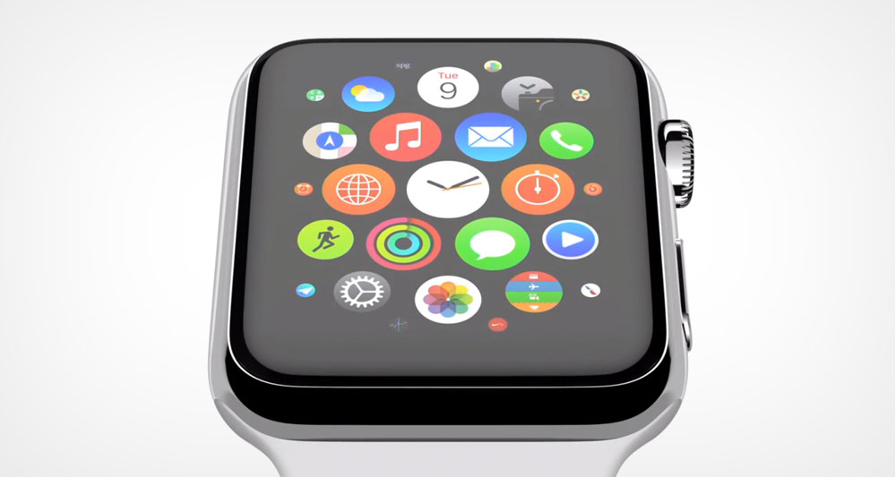
From the Watch Face, you are able to see your Glances and notifications. In order to see apps, you have to engage the Digital Crown. This makes it seem pretty obvious that Apple has purposely designed apps not to be front and center like they are on iPhone. Instead, Apple Watch apps are mere repositories where stored information can be pushed to the user in the form of Glances and via Notification Center.
This may sound a little weird, and I think to some of us it is. We’re used to apps being the focal point. But on Apple Watch, on initial waking, they’re not. Ben Thompson, who was at last month’s Spring Forward event, explains:
Interestingly, Patel and I struggled with different things; he complained about confusing the external buttons, while I kept having trouble with understanding what “mode” I was in, for lack of a better term. Specifically, it was weird that “glances” could only be accessed from the watch face; the watch face, though, isn’t necessarily the “home” screen — the array of apps is. But on that screen you can’t bring up glances. It’s a bit confusing.
Again, this suggests that apps are not intended to be the focus of Apple Watch in the way we understand apps today. Some may think that this is worrisome, that it requires an unexpected and largely insurmountable learning curve. But I disagree. Rather, I think it’s simply a new way — and a more natural way — to think of apps. These new apps aren’t ones we interact with, but ones that hold the keys to unlocking whatever functions our merging physical and digital worlds require, quickly and effortlessly.
That, to me, is the potential magic of Apple Watch.