The Curvy Rectangle
As the debut of Apple Watch gets closer and closer, I’ve been thinking about the stark differences between Apple’s version of the “smartwatch” and Android’s.
We could go through a list of functional differences, but I want to focus on the design. While many folks want to claim that Samsung or Sony or LG made square smartwatches first, that’s a little bit disingenuous. The Android players made circular smartwatches first, too — because they made smartwatches first in general. But the longstanding rumor of Apple Watch’s inevitability is what drove them to release all these designs so hastily. They threw every concept they could think of at the wall in a concerted effort to be “first,” but they forgot about focusing on the “best” part. Apple didn’t. So let’s get one thing straight: The design of Apple Watch is unlike any Android Wear watch that exists today. Saying both are square is as absurd as saying that a Mitsubishi Eclipse and a Lamborghini Huracan are both two-door coupes. You just sound ridiculous.
The one thing that’s fascinating about this new era of smartwatches is that in almost all cases their distinction is not made by the face itself. Go to your local department store and look at all the watches in the case. What is typically the most defining characteristic? The face. The face is constantly changing through various movements in the the second, minute and hour hands. The face has different colors and levels of depth, with components made of different materials. The face catches your eye. These are the main things that separate watches from one another.
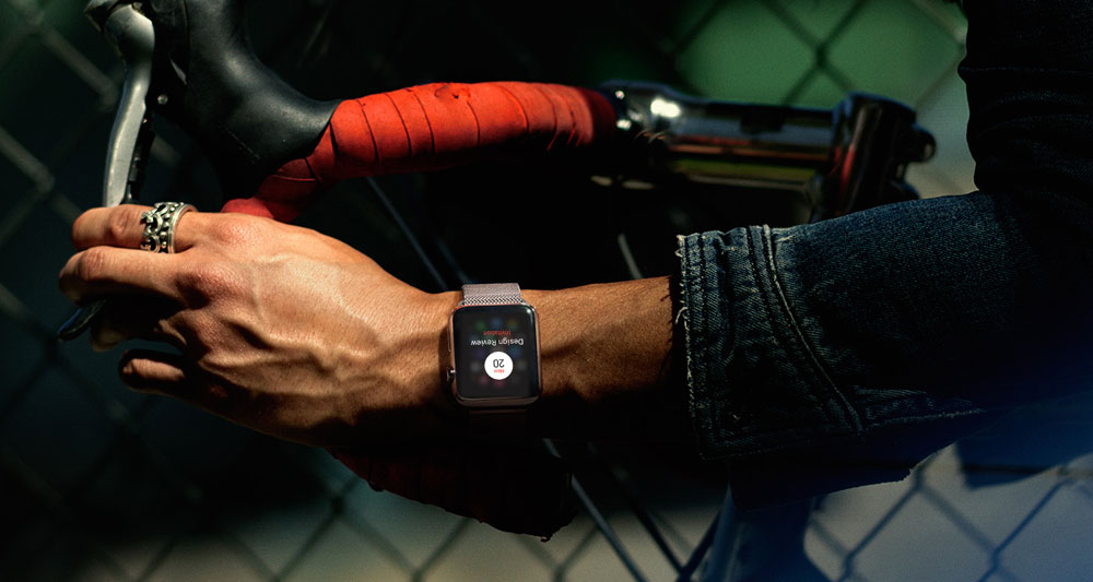
And yet, with smartwatches, none of that exists. But Apple has an advantage here, I think. And that advantage is its curvy rectangular design.
In a world where watch faces are “off” most of the time, being round is like being everyone else. A Moto 360 with a black face won’t look all that different from a Huawei Watch with a black face (or, for that matter, any stainless steel analog watch from most distances). They’ll all look the same, which means they are indistinguishable. That’s not good if you’re an Android Wear manufacturer. It’s not good if you want brand recognition. You want to look different. You want people to say, “Hey, that’s a Moto 360!”

Apple Watch has a huge differentiating factor right from the start. When you see its design in public in the coming year, you will know it’s an Apple Watch. In fact, I’m willing to bet that even if manufacturers get close to copying its curvy, rectangular design, people will still associate it as being an Apple Watch from a distance. Why? Because Apple is going to market the hell out of this thing. Stores, TV commercials, billboards, everywhere. They’re already doing it, and it’s just going to get ramped up to the Nth degree. In the next few months you’re going to see an insane amount of advertising for the wearable, and it won’t take long before people associate “square watch” to Apple Watch.
That’s a huge advantage — an advantage that I think is going to work in Apple’s favor so much that between Apple Watch’s trademarked good looks and huge assortment of interchangeable Bands, Android Wear just won’t be able to compete on aesthetics in the near term. Style-wise, the biggest selling-point Wear has is its round-screened models. That’s a noticeable difference. They look like watches.
But they don’t look like smartwatches.
As crazy as it sounds, there may come a time when wearing a round smartwatch is actually considered uncool.