How The Competition Sizes Up Apple Watch
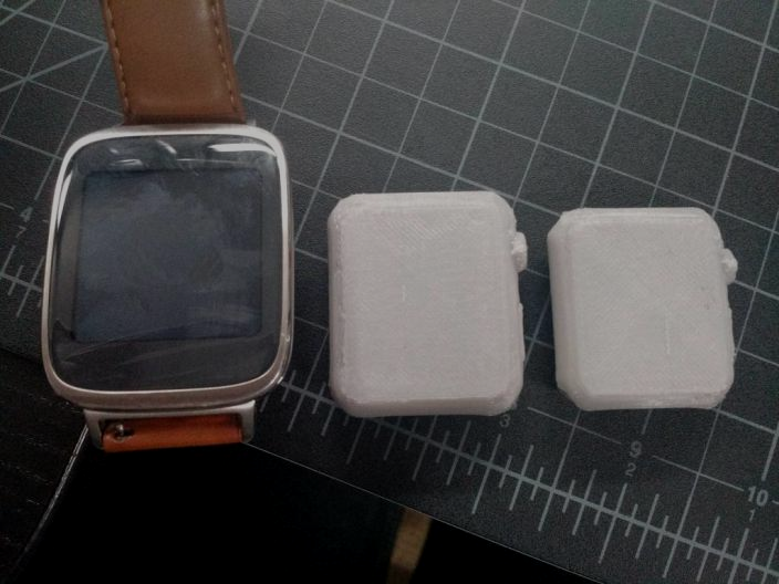
Sizing guides, printouts, and diagrams are fine and everything, but sometimes plain old pictures work best. Take a look at the following shot (via 9to5Mac) for an indication of exactly how both sizes of Apple Watch compare to the Asus ZenWatch:

Now who’s out of their mind, Asus? (Although I admit that designation’s not always a bad thing.)
Here’s another image comparing Pebble Time, Pebble Steel, Apple Watch (42mm), Moto 360, and the original Pebble. With the exception of Apple Watch, this lineup comprises the best-selling smartwatches in history. And the differences, once again, are significant:

Without even glimpsing at the guts, the sizing of Apple Watch alone tells me that the technical expertise that’s been packed into such a small space are absolutely incredible. Apple’s engineering prowess is evident even on the surface, further underscoring the notion that not only was Apple right to ditch circular screens for rectangular ones, but that smartwatch design in general requires that concept — at least right now — to be trashed in favor of optimum performance. At least Pebble and ZenWatch got that much right. Too bad the tech inside them isn’t even close.
Apple Watch looks right for me. And the 42mm Apple Watch looks like the right size for me.