Huawei: Apple Watch has a “geeky, clumsy design”
At the booth of Chinese mobile phone and equipment maker Huawei, the carnival barker approach was used to highlight the company’s smartwatch, called simply the “Huawei Watch.”
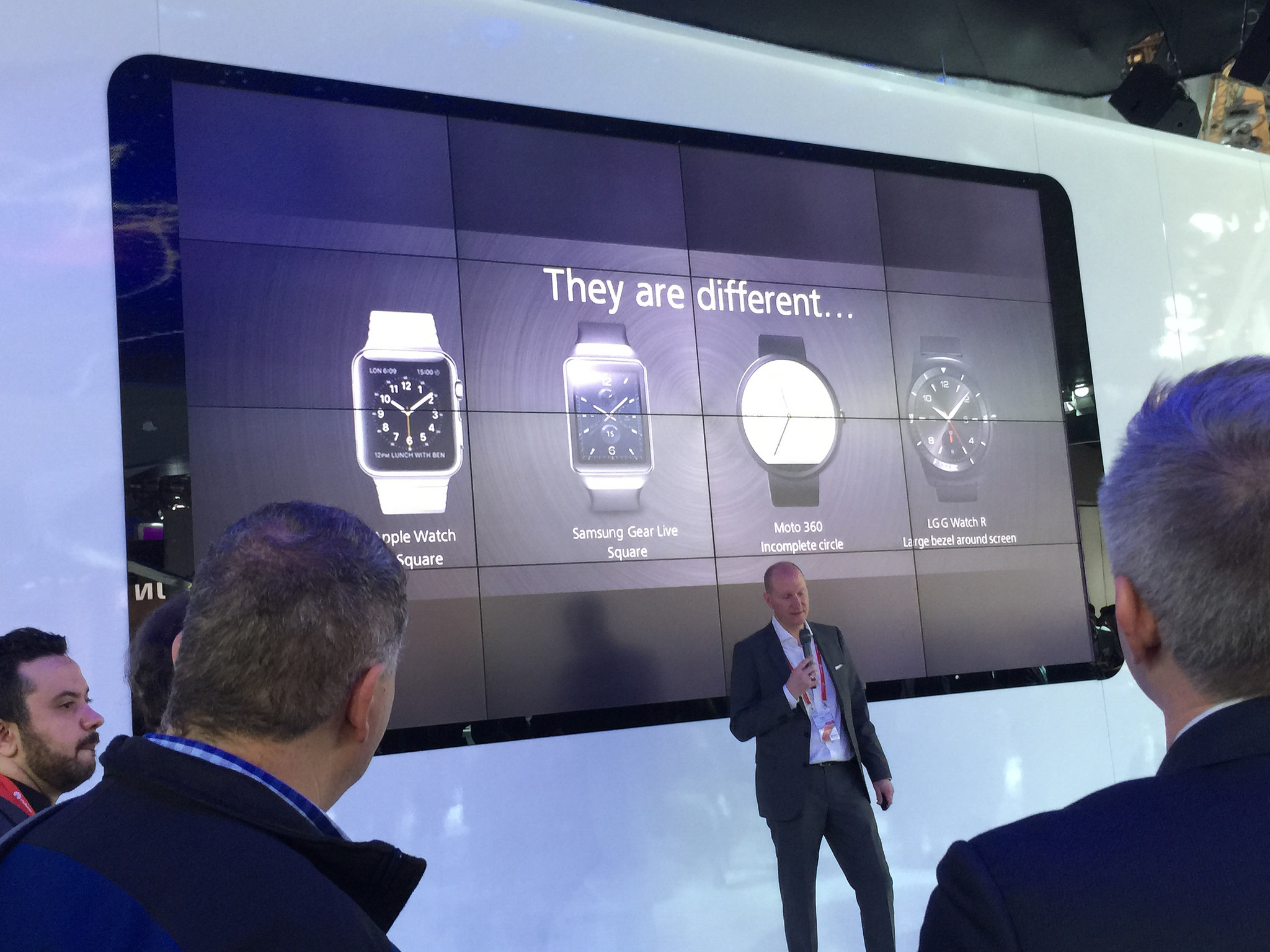
A presenter stood in front of a projection of a slide showing four competing smartwatches as a crowd gathered to hear him talk about why they were not as good as Huawei’s. The devices attacked included Apple’s forthcoming Apple Watch; Samsung Electronics‘s “Gear Live“; Lenovo/Motorola‘s “Moto 360“; and LG Electronics‘s “G Watch R.”
The speaker noted their general weakness: “geeky, clumsy design.”
I’ll be the first to admit that beauty’s in the eye of the beholder. Some folks might think Apple Watch is geeky, clumsy, or both, and that’s fair enough. But you’re going to have a hard time selling the general public on the idea that Apple Watch isn’t a triumph of wearable design, particularly when your idea of a one-size-fits-all smartwatch is a giant 42mm Android Wear affair. Yes, it looks okay for what it is, but that’s not saying much. Only one of the products on stage at Huawei’s round-up didn’t belong there, and it wasn’t the one on the presenter’s wrist. It was the one that just won an iF Gold Award.
You’ve got to love when companies like Huawei go out of their way to rag on Apple Watch’s aesthetics. If you want to see clumsy, just take a look at the Facebook notification shown on the product page for this so-called Huawei Watch. (Clever name, by the way. Just so you know, that’s pronounced “WAH-WAY Watch.” And wah is right, for I see much whining in their future when “geeky” and “clumsy” outsell their masterpiece by a factor of a thousand.)