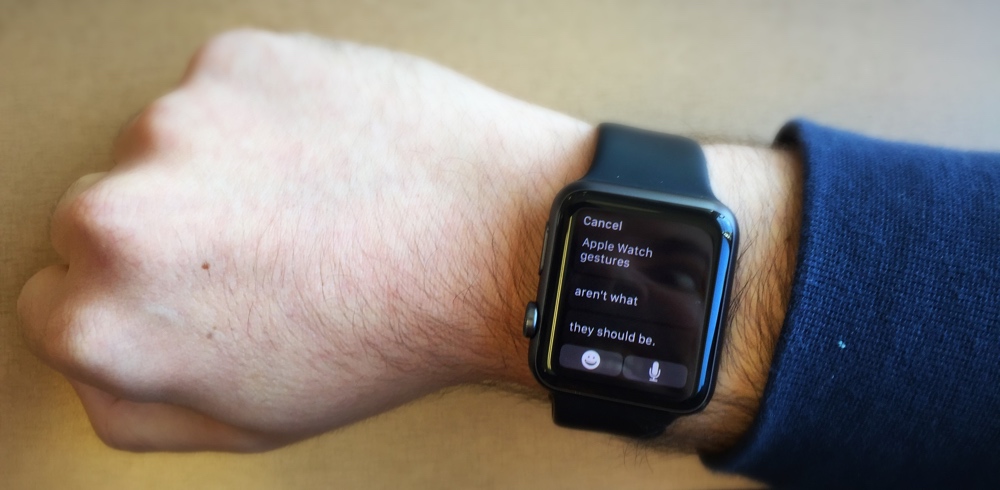
Bernard Desarnauts On Apple Watch Gestures
Bernard Desarnauts, TechCrunch:
Gestures Are Defining Apple Watch
That’s the headline of researcher Desarnauts’ article over at TechCrunch, and — while I agree that gestures will be important to the device’s future, right now, Apple Watch doesn’t do “gestures.”
It does “gesture.”
As in singular. As in one. One gesture. That’s it.
Aside from wrist-based auto-on, there is nothing baked into watchOS that currently utilizes the accelerometer or gyroscope as an actual control mechanism. And frankly, even that aspect of the wearable doesn’t go nearly far enough. The fact that for the first two seconds after you receive a Taptic alert, you can raise your wrist and view a short text or notification is fine and dandy (and sometimes useful), but the actual mechanism just isn’t smart enough.
Initially, before the Apple Watch came out, I’d assumed — perhaps naively — that the device would have some sort of learning, use-based intelligence behind what it shows users and how that interaction would work. Here’s an example of what I mean: Say I get a text message that’s longer than the handful of words the small Apple Watch display can handle on-screen at a given time. When I raise my wrist to view this message, I get a scrollable snippet. Of course, I have to use the silly Digital Crown to look through the entire text, making it a two-handed ordeal, which is annoying and unnecessary. Why isn’t there a “tilt-to-scroll” gesture where I can simply roll my wrist to read the whole thing? That seems like a pretty egregious oversight. Worse yet, when I’ve read the text or alert (regardless of length), I have two options: Reply and Dismiss. Honestly, I understand why these choices are here, but tapping them again involves my other hand. Neither option should.

“Maximus cursus” is right.
If I want to answer a text, I should be able to kick off my template responses or Siri dictation after holding my Apple Watch in its raised orientation for some custom-defined length of time. This should be indication enough that I want to respond. Similarly, an alert — held in the “on” position for x seconds — should automatically dump the user into the Watch App it’s tied to.
Now let’s say I dont care at all about the message or alert I’ve received (a.k.a. almost always). If I raise my wrist, see the information in question, and lower my wrist to go back about my business, this action — or gesture — should be enough to tell watchOS to dismiss the thing. But it doesn’t. If it’s a text, it’ll hang around for a minute or so even after lowering your wrist, and if it’s an app alert, ignoring it simply leaves it in your notifications tray, which you’ve then got to manually clear. I wrote about this earlier with regards to Dark Sky, and it’s still happening.
Real gestures could fix all this, and that’s important for a number of reason, as Desarnauts delves into at the source.
Maybe Cupertino will get there sooner than later, but right now, Apple Watch’s gesture is a one-trick pony.
And that one trick is far from magical.