Apple's Smartwatch Notifications Aren't Smart Enough
When indeed.
A distressing thing I’ve noticed using my Apple Watch is that one of its chief intended functions is not living up to expectations. Worse, it’s failing to do so in a very obvious way. I am, of course, talking about notifications. Being that these are are undoubtedly what the majority of Apple Watch users rely on as a primary feature right now, this glaring oversight is baffling and unacceptable.
So what’s the problem?
Lag aside, here’s the main issue: Notifications are not contextually aware.
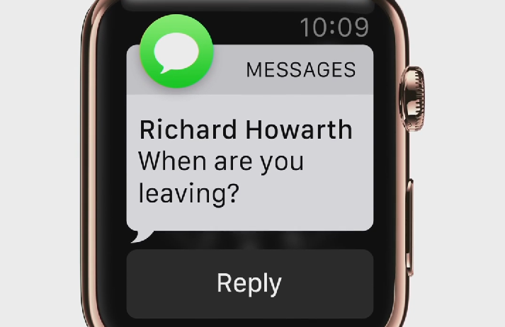
That is, they dont expire automatically, and you can’t dismiss them without three stages of interaction (swipe down, Force Touch or swipe to the left, and tap the “delete” icon). And while streamlining this should be obvious to Apple, it somehow isn’t. I fully expected the company to fix the issue with watchOS 2, but they’re holding back when a solution is so simple an intern could do it. This simply shouldn’t happen:
(In case you’re wondering, we were talking about Aaron Paul on Breaking Bad. Bitch.)
When I get an iMessage notification that’s only a few words long, I read this upon viewing the notification itself. After that, unless I tap the screen to jump into the stock iMessage app itself, I dont need this thing stored in my notifications drawer. I’ve read it. Message received. Duly noted. Delete it, Apple. Get it out of my face.
But that’s not the worst of it. Other notifications, such as those by third-party apps like the much-lauded Dark Sky, offer up instant — and instantly dismissible — information in their notifications. (Which is good, as that’s kind of the point, right?) But these dont go away on their own as they should. If Apple Watch is about light, minimal interaction, I shouldn’t have to clean up after one-time alerts. Here’s a good example of what I mean:
I do not need to know that a light rain started yesterday at 8:59 PM when it’s noon the next day. That notification should no longer be present when I swipe down. That’s common sense, and it applies to just about every app. Remember, Apple Watch is supposed to be about “glanceable information.” I glance at it, and that’s enough. If I want to interact, I will. If I put my hand back down after looking at the message, it should be wiped. That’s what that gesture means! At the very least, such capability should be a setting in the Watch app on iPhone. It isn’t.
While this might seem like a triviality to many users, I believe it underscores a sorry truth about the current state of Apple’s vision for its wearable. In the buildup, Apple Watch was heavily advertised a streamlined, gestural, natural, contextual answer to easing the barrage of information we’ve come to expect on our iPhones. While it’s great that Apple Watch is smart enough to show me only what I need to know (after some tweaking in the settings, anyway), to be truly useful, the device also has to be smart enough to not show me what I dont need to know. For Apple engineers, old information I’ve already consumed would be a good place to start re: the latter.
Looking at a notification and then going back about my business should be action enough to clear the thing. After all, if I really need to see it again, it’ll be in the requisite chat or app logs on my iPhone (or on the Watch App itself).
I’m a guy. I dont clean up after myself. That’s why I have a Roomba, for crying out loud. Come on, Apple. Throw me a bone, here.
Just dont expect me to pick it up.

