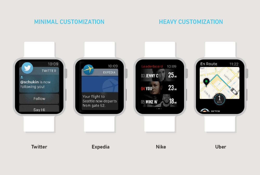
Designing For The Power Of Apple Watch
Cole Sletten writing for Smashing Magazine on why when designing or Apple Watch, you have to consider the future of the Watch as a personal concierge, as well as rethink the idea of app design.
The watch’s “pre-phone” role as a discreet personal assistant means it will never be our primary media consumption or communication device. Instead, it will function as our go-to device for quick personal checking in, screening communication and keeping up with timely alerts and notifications.
To design effectively for these use cases, we quickly realized that we needed to forget what we knew about mobile app design and re-evaluate our assumptions.
This is super fascinating and makes me feel way more optimistic about the future of “apps” on the Watch. Clearly we’re in the early days of wearables and so it seems like some developers are starting to quickly realize that the Watch shouldn’t be thought of as a smaller phone. Instead, we really need to rethink what could be better on the wrist and go from there.
The two questions Sletten asks is “Would I rather do this on my phone?” and “Is this worth being interrupted for?”
In most of the apps I’ve used on the Watch, I feel I could answer “Yes” and “No” respectively to the above questions. Many developers simply aren’t thinking deeply about the position the Watch is in. What they’re doing is seeing the Watch as an opportunity and quickly stripping out their iPhone apps to “fit” on the Watch. That’s totally the wrong way to do it.
Regarding the App screen, aka the HoSletten also says what I’ve felt from the start:
The home screen will not be the primary way people enter your watch app. In fact, they may almost never experience your app that way.
He also believes that the Home screen is Watch face:
In reality, the “home” screen of the watch is — wait for it — a watch display. Perhaps we shouldn’t be so surprised, but the sheer out-of-the-wayness and marginal utility of Apple Watch’s app screen caught us off guard. And if initial reviews are anything to go by, we were not the only ones to be surprised by this discovery.
I completely agree and it’s why I think the rolling out of third-party Watch faces is taking more time than many of us want. I don’t think it’s going to be a way of just displaying the time. Instead, I think (and hope) Apple’s approach is to see the Watch display as a blank canvas, with the ability to look at anything at the raise of your wrist. No tapping, no scrolling. Just raising.
If you’re someone with any interest on the future of Apple Watch, you really ought to give this article a read. Thinking about how the Watch will benefit us is not going to happen overnight, but Sletten has the right mindset.