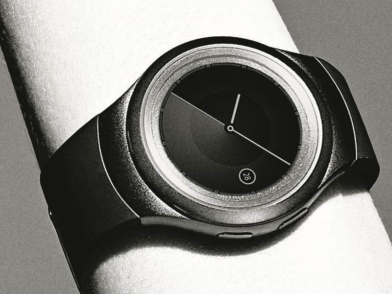
A New Argument For Round Smartwatch Displays
Antonio Villas-Boas, Business Insider Australia:
And the fact that the Gear S2 is round compared to the Apple Watch’s rectangular design is pretty significant. Don’t get me wrong, many people, including myself, like rectangular watches. But it just seems like a round display can show you information more efficiently than a rectangular display.
I’m certainly an advocate of the round smartwatch. After all, I wish Apple Watch were round! But this particular argument — generalized as it is — kind of falls flat. While I do think there’s a way to make circular screens data-dense (and while I hope Samsung has at least started to solve that puzzle), the above statement definitely goes against the status quo re: the industry’s accepted ideas of pixel efficiency.
The big idea from Villas-Boas’ perspective seems to be that Samsung has curved some text along the bottom of the Gear S2 watch face:
That’s cool and all, but you’d have a hard time convincing anyone that it’s easier to read such an arrangement than it is traditional horizontal text lines. In other words, though this solution is something, it’s certainly not enough to buttress the notion that “a round display can show you information more efficiently than a rectangular display.”
Especially not once Apple allows third parties make their own custom Complications.
