Ranking The Apple Watch Faces
Lily Prasuethsut of TechRadar India has had the good sense to put together a ranked list of the 10 different Apple Watch Faces, which is something I can’t believe I didn’t think to do myself weeks (if not months) ago. Here’s her list, in order of worst to first:
- X-Large
- Modular
- Color
- Motion
- Solar
- Utility
- Mickey Mouse
- Simple
- Astronomy
- Chronograph
Obviously, Lily is incorrect.
Well, mostly. She did get the Chronograph’s spot right, but everything else is all out of order. So here’s my list — the definitive list. And you may rest assured that it’s 100 percent complete and 100 percent right on the money. (Bear in mind that Complications — or the ability to add them — play no role in my rankings. By Apple’s count, there are over two million outcomes when customizing these, which makes the task impossible. But mathematical impracticality aside, I wouldn’t include them anyways, as it’s my feeling that each Face actually looks quite a lot better when all those extra doodads are turned off). Counting down, without further ado:
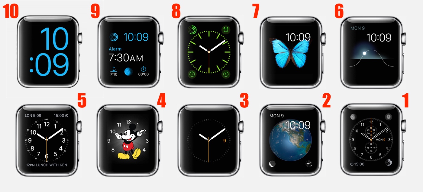
- X-Large
- Mickey Mouse
- Utility
- Color
- Simple
- Chronograph
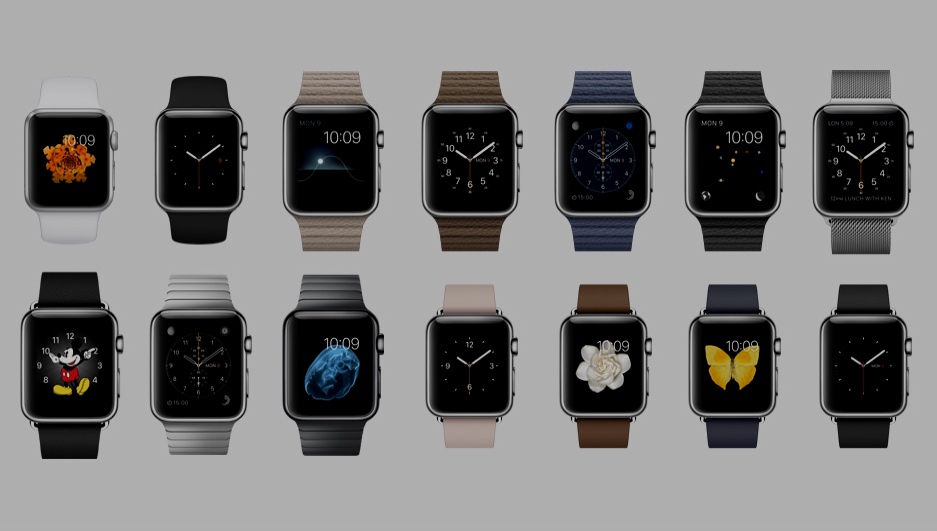
You’ll notice that I didn’t include Modular, Motion, Solar, or Astronomy in my list. That’s because they’re all garish, ill-considered garbage with — if I may be so bold — asymmetrical, bezel-highlighting, and often hard-to-read designs that render the lot a lot less than optimal as watch faces in general. When I want to quickly check the time, I don’t need a number-obscuring flower animation to make the task take longer than it needs to, nor do I want something that looks for all the world exactly like a stock iPhone lock screen. I’ll have no part of these non-skeumorphic tragedies on my Apple Watch, and neither should you. (To be fair, Astronomy is more like an app than a Face, and in that Star Walk-esque context, it is pretty cool.)
Now for my reasoning behind the choices that made the cut:
First, X-Large is, by any measure, the ugliest, most off-center option you can pick. It’s so crummy that Apple doesn’t even advertise it with the others on its website. However, because it’s designed entirely with the vision-impaired in mind and is a fundamental accessibility necessity, it gets a pass. Hopefully, I won’t need to use this Face for a few decades still, but it’s nice to know it’s there for all the folks who do.
Next is Mickey Mouse. And while I’d rather have Merlin or Archimedes (or squirrel Wart) dancing around my Apple Watch, it’s hard not to appreciate the classic crispness of Mickey’s herky-jerky animation style. Here’s hoping the cultural icon is just a precursor to a whole slew of Disney-inspired first-party Faces.
The next three options are all mostly similar, with Utility being just bland (or is that “utilitarian”?) enough to fall out of the top three. Color and Simple can look quite similar to each other when certain settings are dialed in just so, albeit the former might have the edge if this were a purely fashion-oriented exercise. But it isn’t, and Simple has enough refined clarity and contrast to get the nod.
Of course, Chronograph is the winner by a wide margin. Clearly, it’s the Face that got the most attention during the design phase, and it’s the one most accessible and interesting to traditional luxury watch-wearers — you know, people like Jony Ive and Marc Newson. The Simple Face is elegant and referential in much the same way, but there’s just not a whole lot to it, and Chronograph makes Apple Watch really stand out as an horologically-inspired device. That said, once third-party designers and established watchmakers are able to offer their official dials and designs on Apple Watch, my list is bound to change.
But for now, this is how it is. And though your rankings are probably different, don’t feel bad.
Remember, it’s okay to be wrong.