Interface, Options Revealed For Apple Watch iPhone App
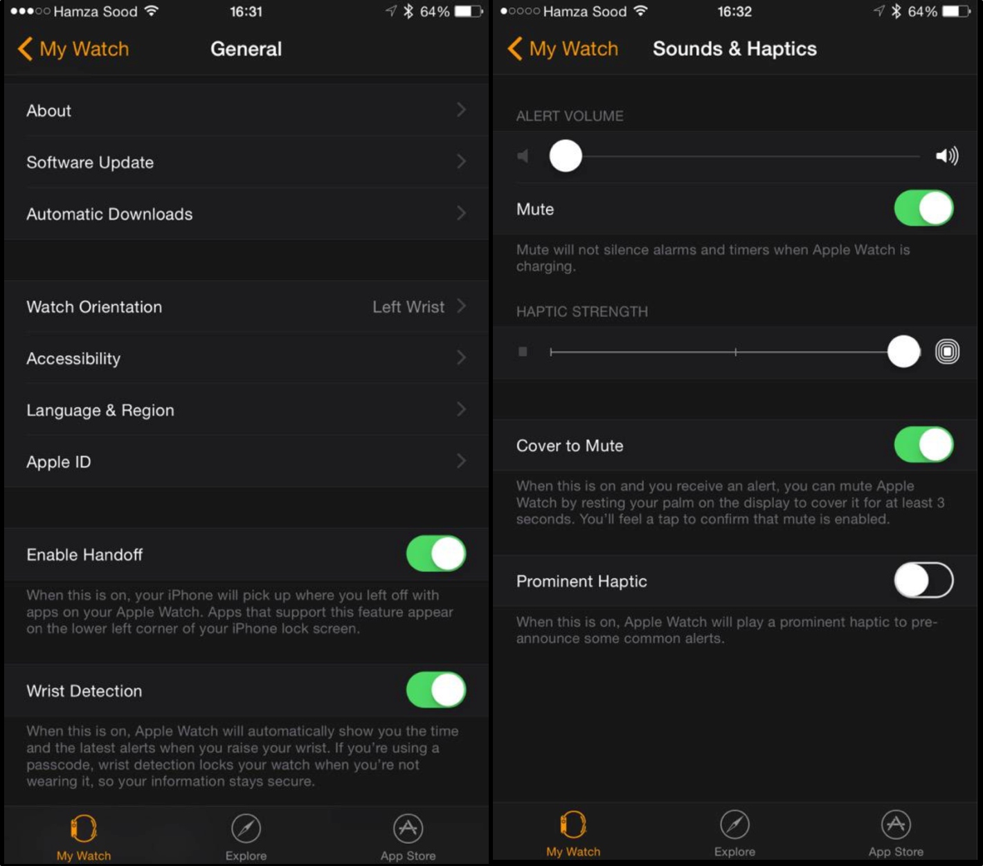
[T]he interface is dark black, like the Activity app for fitness revealed yesterday, and includes all of the functionality we detailed earlier. Some interesting new settings, however, were revealed today, such as one for assigning a left or right wrist to the Watch, Handoff support, Haptic Strength, and volume levels.
While I’d hope that some of these settings would be available on Apple Watch itself, I can understand the rationale behind moving the clutter of such an in-depth menu over to iPhone. If you want to see more, the source above is hosting a 25-picture gallery on the subject, and you should check it out. There’s not too much more insight to be gleaned, however, and the gist seems to be this: As customizable as Apple Watch is, you’re actually going to be controlling most — if not all — of those parameters from the bigger hub in your pocket.
Just set it and forget it!
[Note: I guess I owe the WatchAware theme team an apology: Black and orange apparently do say “Apple Watch” after all. Whodathunkit?]
