
DataMan Next: Simple Data Rate Management
There aren’t many apps that translate well to Apple Watch, and the search for functional third-party utilities are few and far between. Still, there are problems to solve, and some of those solutions actually lend themselves to the wrist in a meaningful, compelling way.
DataMan Next by developer Johnny Ixe of XVision is one of them:

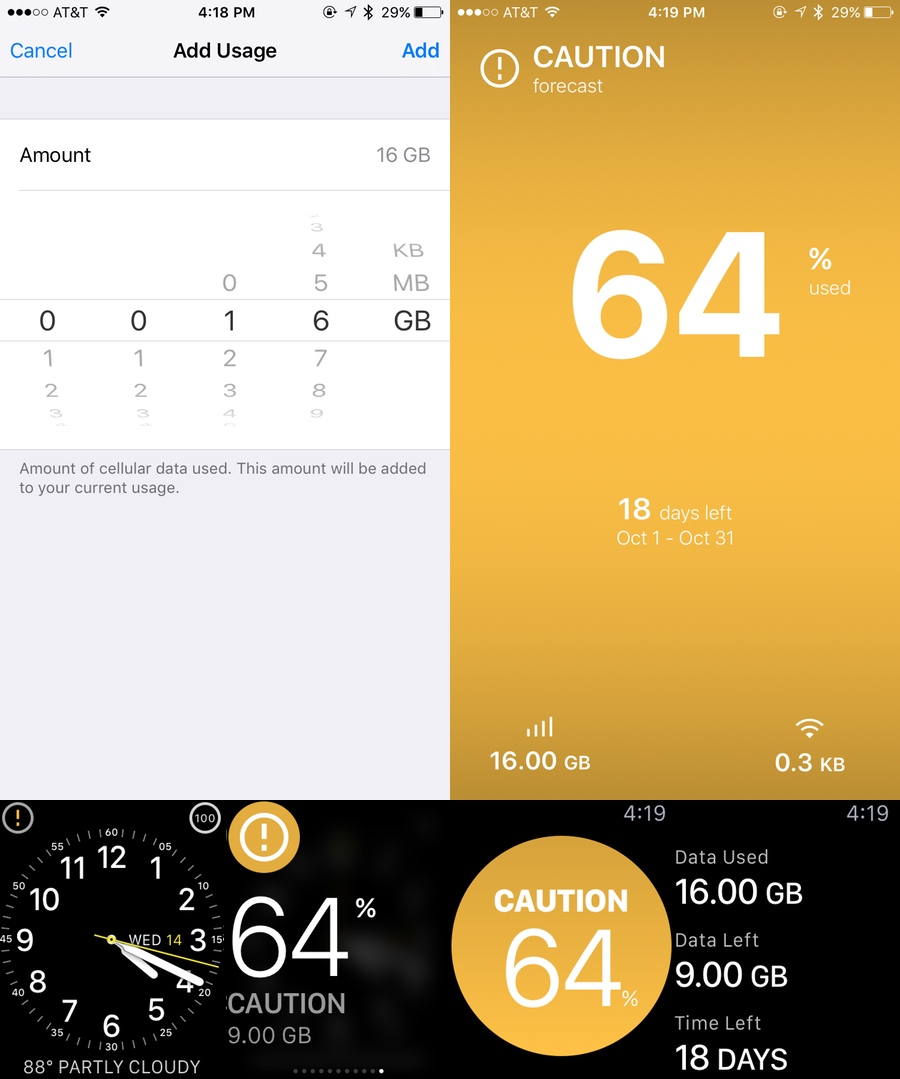
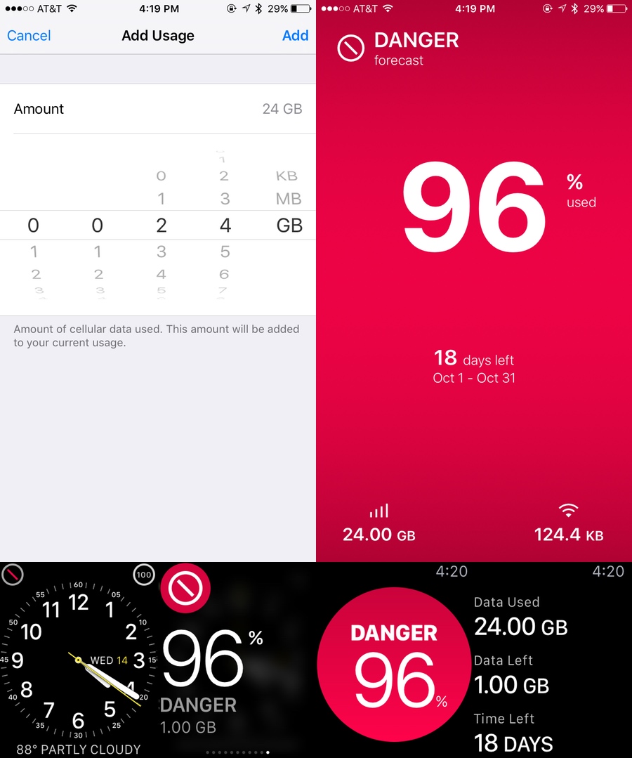
The app is extremely basic, and it’s entirely manual to set up, making it very customizable. To get going, you just open DataMan Next on your iPhone and enter your data plan details: billing cycle type, start date, allotted GB per cycle, and amount of data already expended (examples of the last of these included further below):

From there, you just let the app roll in the background, and it’ll keep track of your traffic. As you approach your stupid carrier’s stupid cap, DataMan Next will alert you via color and count. Green means safe, orange means caution, red means danger. It’s that simple.
It’s also subjective, though. If you’ve burned through 90 percent of your cap by the 27th day of your plan, you’re going to get a green “all clear,” as there’s no real threat of exceeding your limits. However, if you’re 90 percent through half-way in, you’ll get the requisite warning. Similarly, if you’ve used over half of your data a few days before the mid-point of your cycle, you’ll get orange. A few days after, however, and you’ll get green.
The Apple Watch iteration of DataMan Next offers a Glance that shows actual numbers along with the appropriate color codes, and it makes use of watchOS 2 by providing custom Complications. My only complaint here is that the small corner Complications (the only type currently supported) merely show a colored symbol representation of the “alert level.” I’ve been on the green “check-in-a-circle” for two weeks. And though that’s great, I think I’d like to see the percentage of use tracked in the Complication instead. (Maybe Ixe doesn’t offer this in an effort to avoid confusing users, as such a presentation could easily be glossed over and dismissed as remaining battery life. I get that. Still, perhaps Apple should add the option to end users of further customizing their custom Complications.)

The only real issue with DataMan Next is that it has no way to handle shared data plans (“family plans”), which are the norm in the US. Additionally, the native data-tracker on iPhone doesn’t account for your plan — it merely shows the total usage since the handset’s last reset. That means that, as far as “synching” with your fellow plan users, there’s no automatic way to get that done. At least, not at the system level. Perhaps Ixe can work out an in-app way to sync usage data from multiple users once a day or so should each agree to be in the same DataMan “room,” but right now, the only option is to coordinate with your friends or family IRL and set up each iPhone’s DataMan app with an appropriate divided limit of total data. That’s certainly not ideal, but it’s not a deal-breaker, either.
At $1.99, DataMan Next will pay for itself five to seven times over if it even helps prevent only one “extra GB” carrier charge, so it’s a great bargain and a tremendous tool for heavy data users (a.k.a. everyone). Ixe also offers a “Pro” version with more statistical breakdowns and an “Enterprise” version for the international businessman with multiple carrier/plan/roaming needs.
There aren’t many “must have” Apple Watch apps out there yet, but DataMan Next is one of them.
And even though we aren’t doing ratings and structured reviews right now (that’s coming), this app gets five stars, or 10 points out of 10, or 100 percent, or whatever metric we finally decide on.
Purchase immediately.