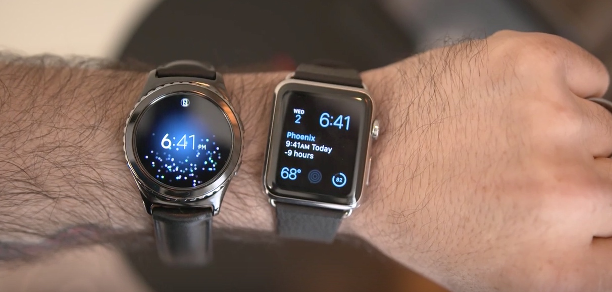
"The Watch Face Wars"
John Moltz on switching his Watch face from Utility to Modular:
I can read the date now because this face’s complications are larger and I get more information with this face than any other. It does kind of scream “SMARTWATCH!” which at first I was uncomfortable with, but I’m coming around to the fact that maybe that’s OK or even as it should be. I do actually own a smartwatch and it’s not like a round face is fooling anyone. Also, I want to be able to get all the utility out of it I can. This face allows for the time and five complications, which is the most allowed. A few other faces will do that many, too, such as Simple and Chronograph, but you can get more out of Modular. Simple has a larger date number than Utility, but it still gets covered by the minute hand. Adding insult to injury, Chronograph’s hands are faux hollow. They look like white wire frame hands, but they’re filled in black. While the bottom row of complications is still just small squares on the Modular face, they’re the larger of the small square complications. Putting the a complication in the middle provides added information. For the weather, it adds the location, current conditions and the daily high and low. The default is the date which shows your scheduled items for the day. I’d rather have the weather because, as my fellow podcast hosts can attest, I never schedule anything.
This is something I’ve been thinking a lot about and have even tweeted about in the past.
Basically, as Moltz points out, the analog faces on the Apple Watch make poor use of the display’s real estate. They may look nice but the truth is they providing little info for the amount of space they take up.
That said, I can’t stand the Modular face. It’s just way, way too geeky-looking for me. I know it’s more useful and I know it can give me more information, but right now, it’s tough for me to use it simply because I appreciate looking at something nice. Plus, I still do get more information, it’s just not as informative.
That said, I think faces will change over time. In fact, I think Modular really is the most forward-thinking Watch face Apple packages with the Watch. I also think that in time, the time aspect of the Watch will slowly disappear, sort of like the phone in the iPhone.
This is also why I think round, in the long term, is likely the wrong choice if you’re really trying to push the needle forward. Sure, round is a tad nicer looking when compared to square and we all know that if Apple built a round smartwatch it would be beautiful, but the problem is about information and glanceable data. In 5-10 years, are we really going to be using watches to tell time? Will that be even 1/4 of the reason we wear them? It’s hard to say, but again, I look at the iPhone and ask myself “How often do I make phone calls?” Answer: Rarely.
This is also another reason why I want to see third-party Watch faces in the App Store. I think that could open the door to some innovating thinking.