New Service, Gyroscope, aims to be a Central Dashboard for All Your Biometric and Social Data

Gyroscope’s Dashboard
Anyone who is into capturing personal metrics—whether it’s Apple Health, Fitbit, or any of the other myriad activity tracking devices on the market today—is aware of the some of the limitations of these isolated data silos. Once you commit to a particular service, your data and social interactions are often limited by that particular service’s network and features. Apple Health, in concert with the iPhone and Apple Watch, attempts to address this isolationism by consolidating your data in a central repository, however, Health’s visualizations of your data are very simple and linear, and only representative of your biometrics. What if you could combine all of your social and personal data into a central dashboard that portrays visualizations of your timeline in creative ways? This is the experiment that is Gyroscope.
Gyroscope currently integrates data from Runkeeper, Strava, Fitbit, Jawbone, Moves, Withings, Google, Instagram, Facebook, Twitter, Foursquare and RescueTime. Noticeably absent, for now, is Apple Health Data, although, according to the site, that will be available along with the upcoming release of Gyroscope’s iPhone app.
Within Gyroscope, by default, your data is private, however you can choose to share you information to your Friends, or even publish it publicly on your own domain. The basic service is free, and includes an online profile dashboard and weekly “reports of your life.” A Pro account is also available for $7/month, and adds profile themes, custom domains and early access to new features.

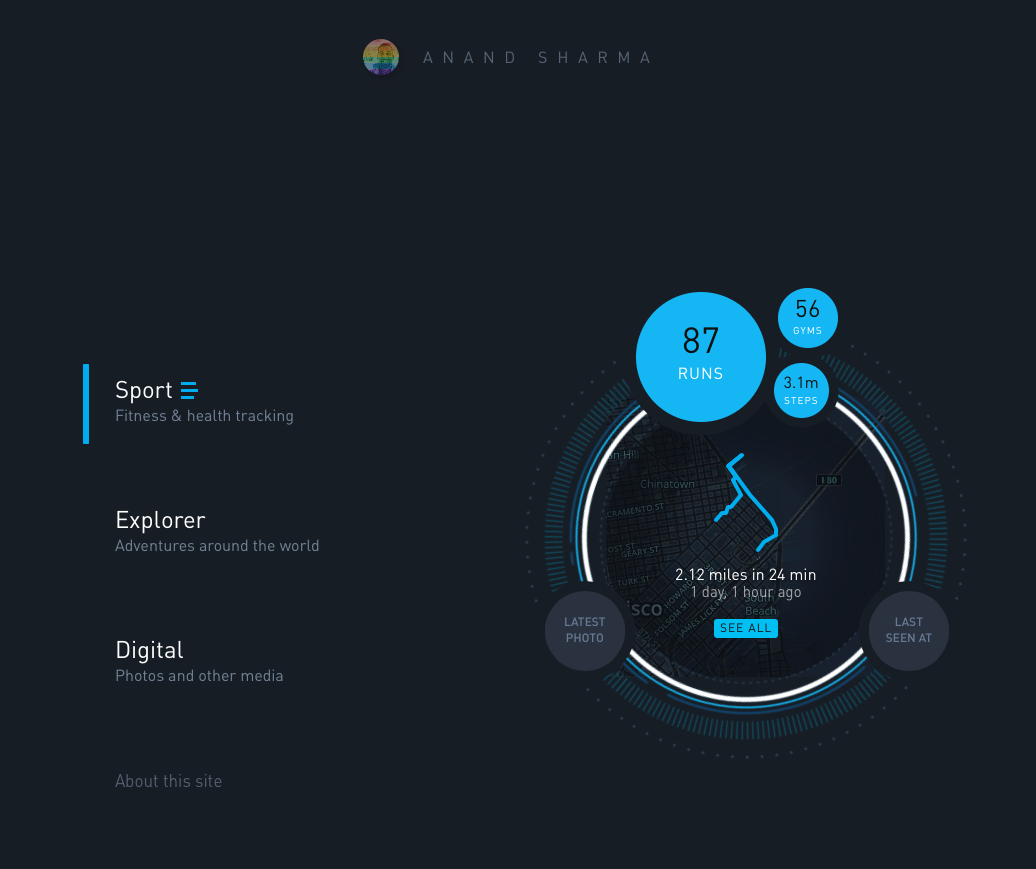
One of the best things about Gyroscope is the interface, which is stunningly designed and fun to explore. Gyroscope offers many different kinds of reports, which are categorized under 3 main categories of “Sport,” “Explorer,” and “Digital.” Although some of the reports are fairly linear, such as those under Digital (which simply offers a merged stream of your photos), others, such as those under “Sport” and “Explorer” graphs data and social content as timelines, scatter plots, maps and soundtracks. Each level of visualization offers views to dive deeper into your data.

Clearly, the more services you connect to your Gyroscope dashboard, the richer your visualizations will be. Gyroscope is certainly both ambitious in its scope as well as a work in progress. It will be exciting to watch how it evolves and incorporates even more services and data in interesting new ways. If you are a personal data geek like me, you should definitely check it out.