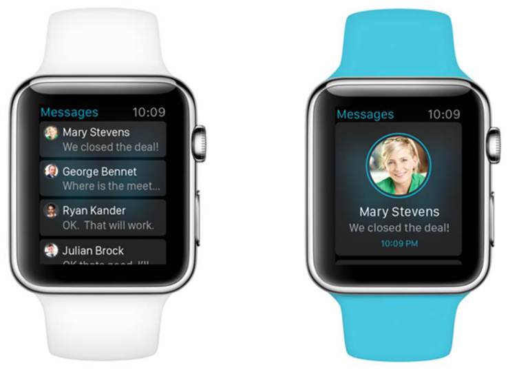
Simplification and the Apple Watch
Just like every app does not belong on the Apple Watch, every iPhone interface will not transfer to the face of a wristwatch. Over-simplification is important. You may think your iPhone app is sleek and simple, but everything changes when you drastically reduce the screen size.
Simplifying isn’t just about design; it’s about reducing the number of available features on the app. Many of the browsing or text-heavy portions of a smartphone platform are no longer applicable on the watch form factor, requiring developers to determine which features are used the most and eliminate the rest.
This is such an important part of designing for the Watch which is why I think many of the apps that exist today aren’t very good. Sure, some apps are slow due to the fact that they aren’t running natively, but the heart of the issue is that most developers haven’t deeply thought about how or even if their app belongs on the Watch. The truth is, some apps will greatly benefit from being on your wrist, while others won’t so much.
That’s why I think the Watch will take some time to truly become a “must have” product. The iPhone went through this cycle too. Apps in the beginning weren’t all that great but within a few years developers truly understood the value of a touchscreen with a camera in your pocket. Eventually, as hardware got faster and more capable, we started seeing something truly magical happen.