The Verge's Pebble Time Review
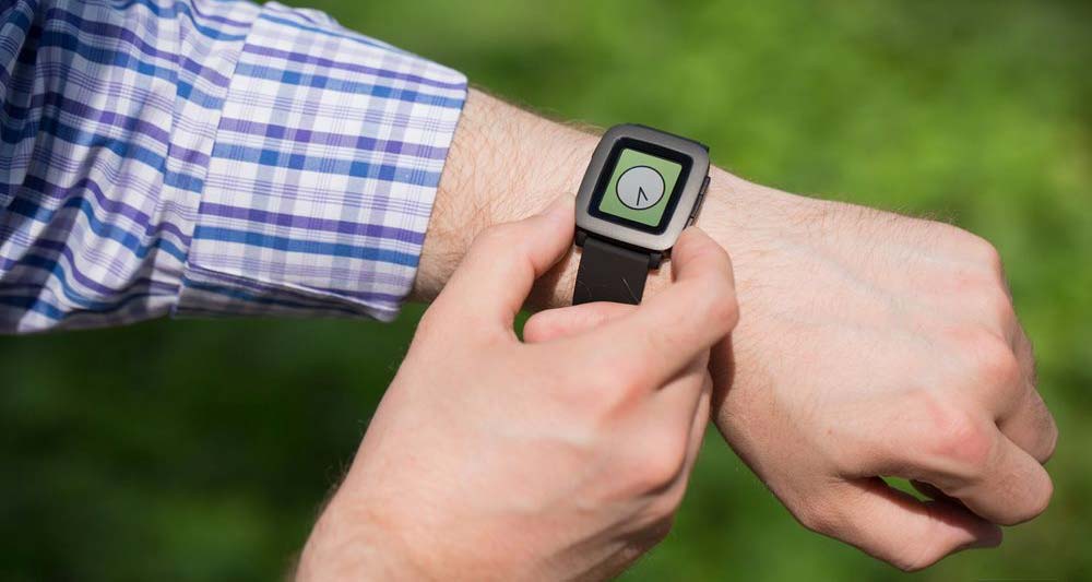
Time is mostly plastic and doesn’t have the nicer materials of its competitors. The best way I can describe the Time is that it’s, well, creaky and a bit toylike. Push on the bottom of the display and you can hear the plastic parts rubbing together. The strap lugs have sharp edges that can poke into your skin. And the plastic buttons are the exact opposite of reassuring.
Wait there’s more:
…If you have an iPhone, notifications on the Pebble Time are far less useful. The Time will buzz (and I mean buzz, it’s like a can of angry hornets on my wrist) with every notification that lights up my iPhone’s display, and there’s no way to filter them specifically for the watch as you can with an Apple Watch or Pebble with Android. Further, the only thing I can do with an iOS notification on the Time is dismiss it — there are no voice replies or quick actions with an iPhone. Pebble says it is working to add voice replies to Gmail notifications on the iOS, but it’s not likely that it will be able to for text messages.
Wait there’s more:
Don’t get me wrong — the Time is far nicer than Pebble’s first effort, but that’s a pretty low bar to achieve.
Here are the pros and cons according to Dan Seifert:
Pros
Improved design
Display is always on, visible outdoors
Long battery life
Cons
Creaky hardware
Limited iOS capabilities
Limited voice control
So what’s the final score you ask? A 6.8. Not bad… What bothers me the most is how that compares to what the Apple Watch scored – a flat 7.0.
How is the Pebble Time only 0.2 less on the Verge’s score when compared to the Apple Watch, especially when the Watch is being praised for good design? Does it really boil down to the $349 starting price point?