The Interface Flaw In Apple’s Latest Gadget
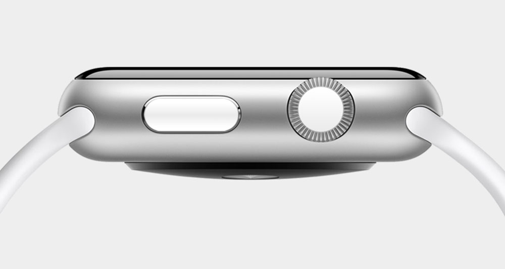
It all sounded compelling at the time, but once you actually start using the Watch, it’s clear that the Crown just isn’t that revolutionary. And that’s fine — it doesn’t need to be. What makes the Watch so interesting and successful as a product is the total package: the sensors, the Taptic Engine, the elegant brevity of glances, and so on. It doesn’t need a flagship input mechanism. A supercomputer on your wrist is the flagship input mechanism. Let the Digital Crown be a home button; let it toggle between two homes if that’s what’s required. But don’t overload it with functionality in order to make it seem like an interface breakthrough on the level of the mouse or multitouch. Get back to the focus and restraint that characterized the iPhone’s original button. Bring it all back home.
I have to agree with much of what Johnson says. While I have no issues with the Digital Crown, after reading this piece, I think there are some things Apple could do to make it a tad bit simpler.
I also wonder how Apple will approach the UI of the Watch. With the iPhone, Apple didn’t really experiment much. Icon placement is exactly the same as it was in 2007. But with something like the Apple TV, Apple has played around with the UI more than a few times. Will Apple do something similar with the Watch or are things set in place and we’ll just see minor tweaks from here on out?