How Virgin Built Their Virgin Pulse Health Monitoring App
Rocket Insights, a software design agency, has recently partnered with Virgin Pulse to release an activity tracking app for the Apple Watch. In a blog post posted on the company’s site, the company talks about what they learned in building the app.

What’s fascinating about Rocket Insights insights (it’s weird to say it like that) was how the arrived at some of their decisions. For example, in regards to which features should be replicate on the Watch from the iPhone the company realized that it only made sense to replicate ones that were better on the Watch, not just as good:
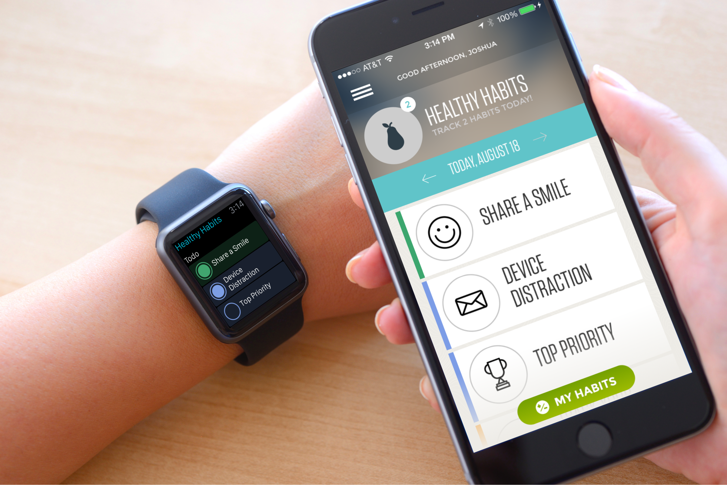
We discovered that the only features worth replicating were those that were actually better on the Watch. Not just the same, but easier, faster, or more delightful. For example, one of the core features of the Pulse platform is the healthy habits list: the list of habits you are trying to improve each day. This was one of the few features we did bring over to the Watch because we could make them easier and faster to enter there. When you open the Watch app you can tap extremely quickly to complete those habits you’ve done that day. But we did not bring over the whole healthy habits feature set. We left much of the functionality around managing and learning about habits to the iPhone and Web experiences. Those experiences are much better on those platforms. In the end we only brought over the small fraction of the feature, a small fraction of our original.
Gosh, I wish more app developers would think this. Too many developers think that bringing everything over and putting it on the wrist makes sense, and they couldn’t be more wrong. Instead, as Rocket Insights points out, they can’t just be the same, they have to be easier AND faster. The more app developers realize this, but better they’ll be.
Another great insight was what they called the “Notification Rule.” They spoke with Apple as well as other Watch owners and realize that Notifications had to be bite-sized.
So as we built out the Virgin Pulse app we made sure to pay close attention to our notification strategy. As the saying goes, timing is everything, so we chunked notifications around certain times of day and made sure they were actionable. This was crucial to creating valuable notifications. Making notifications actionable was the number one variable in making them valuable. It doesn’t mean that users have to respond to a notification, but the information needed to be valuable enough that it might change the user’s behavior during the day.

I actually love what they did here. Notice that the entire Notification fills up the whole screen. The text and image do not require that you scroll down in order to read them. It’s one of those things I feel many developers miss. I want to touch my Watch screen as little as possible. The more I have to, the more I find it to be a distraction rather than a helpful device.
Rocket Insights goes on to discuss other important things they’ve learned about building an app for the Apple Watch including the importance of making the app feel “lightweight” even if it does have many different interactive screens.
You can check out the full post here.