Redesigning the Apple Watch UI
Luke Wroblewski, a well-known Product Director at Google has published a piece that proposes how Apple should consider redesigning some of the user interactions of the Apple Watch in order to make navigating through the Watch an easier and more pleasant experience.

Wroblewski says that while he enjoys wearing a smartwatch, the Apple Watch’s hierarchy of notifications is not right. He believes the company is putting too much emphasis on apps which he believes is unnecessary:
Thanks to “long look” notifications, I’m also able to take action on some notifications —mostly to triage things quickly. Much more rarely do I engage with Glances and even less with apps. This creates a hierarchy of use: notifications, glances, apps.
Unfortunately, the Apple Watch’s interaction model doesn’t echo this hierarchy. Instead, there’s a lot of emphasis on apps, which seems to create more UI than is necessary on your wrist.
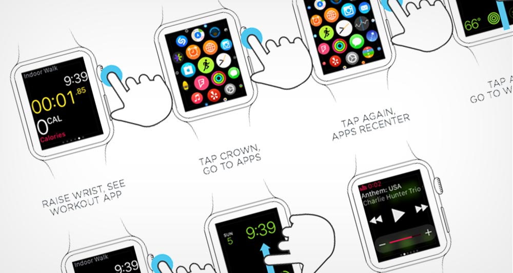
Wroblewski gives several examples of how Apple’s interaction model requires far more taps and swipes than should be needed for something that you wear on your wrist. After all, the whole idea is that things should be super quick.

After some examples, Wroblewski shows us his proposed UI for the Apple Watch which would slightly change some of the ways you view Notifications, Applications, and would get rid of Glances entirely and be replaced with views of the actual apps themselves. He would also get rid of the orb-like app interface found when you pressed in the Digital Crown.
Glances are replaced with the ability to scroll through active apps. But that doesn’t mean “glance-able content” goes ways. In fact, each app could have a “glance-like” home screen as its default (it could even be the Glance) but also display its last used screen when appropriate (like after you’ve recently interacted with the app).
I have to admit, after reading this piece and looking it over several times, I do think Wroblewski has a better solution than what Apple is currently shipping. While I don’t find the Apple Watch confusing, I do believe many interactions could be better and faster. Maybe Apple should consider hiring this guy.