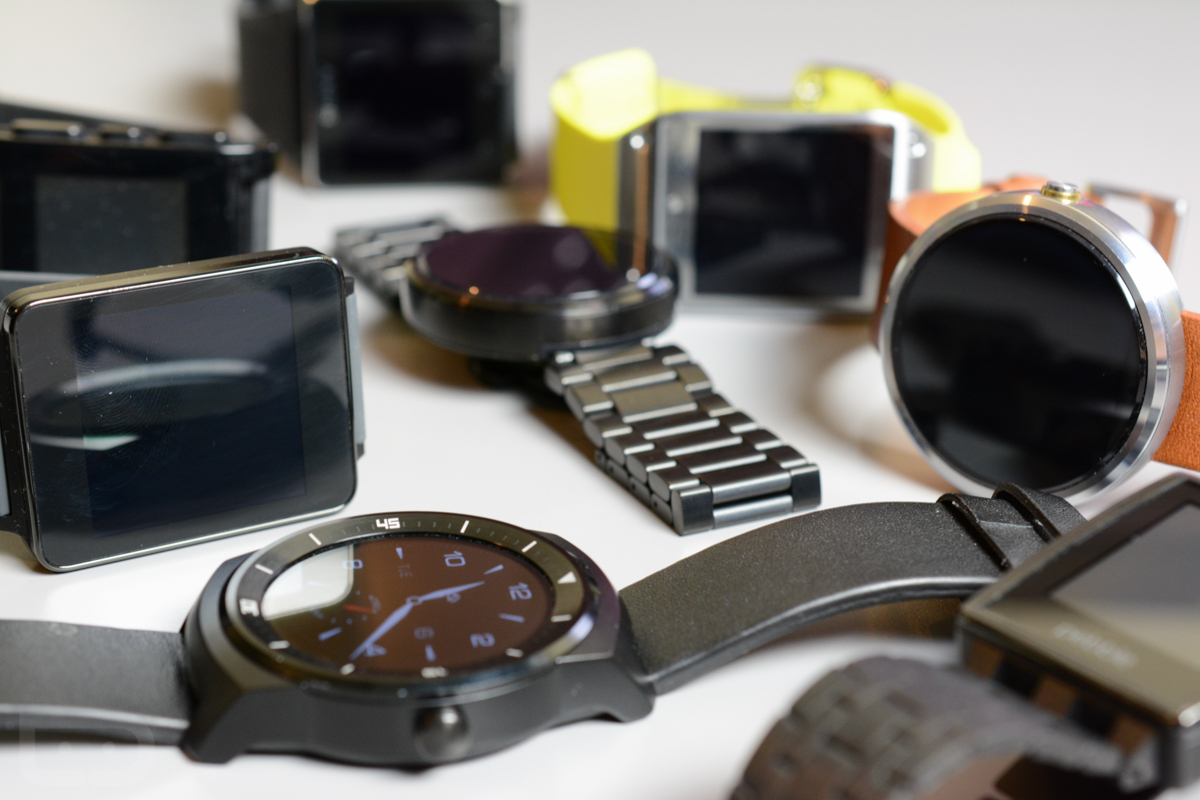
Everything Wrong With This Graphic Comparing Android Wear to Apple Watch
Luke Wroblewski, a product director at Google who often publishes small infographics demonstrating how particular UIs work, has recently tweeted a screen flow of how viewing stocks on Android Wear featurewatches compares against doing the same on Apple Watch. The graphic essentially suggests that viewing stocks on Apple’s smartwatch takes far more taps and swipes than using Wroblewski’s own company’s offering.

I can only assume that Wroblewski doesn’t own an Apple Watch (although it’s probably a good idea for Google’s product people to get as familiar as possible with the competition). If he did, he would realize that there are a myriad of ways to access stock data. And one of these doesn’t require the user to even touch the screen at all.
To help Wroblweski understand the various ways to get into the app, I’ve outlined all the ways to do so:
Complications – You can set your favorite stock to be on the Face of your Apple Watch. This quite literally requires no touching whatsoever. Just lift your wrist and your biggest windfall (or boondoggle) is right in your face with info on the current price as well as how that price relates to yesterday’s. Want more information? Tap that Complication one time and you’re brought right into the Stocks app, where you can see lots more information, including daily price highs and lows, trading volume, market cap, P/E ratio, and more. All this information is just a single tap away.
Glances – Apparently, Mr. Wroblweski doesn’t realize that you can change how your Glances are organized on Apple Watch. Notice how he basically ensures the worst iser experience by making Stocks the fourth Glance to display. If stocks are important to you (as they’d have to be for this to be an issue worth any consideration in the first place), you can simply set the appropriate app as your very first Glance (via the Apple Watch iPhone app). Once you’ve done that, any time you lift your wrist and swipe up, the first thing you’ll see is Stocks. Instead of a single tap away, with Glances, Stocks is a single swipe away.
Siri – Yep. You can just ask Siri, and she’ll tell you what the the price of any stock is. Simply lift your wrist and say something like, “Hey Siri, what’s the price of Tesla Stock?” Siri will then respond with the answer, all with zero touching or swiping required.
Also, why didn’t Wroblweski show more detailed information on Android Wear? All it shows is current price and the dollar/percent difference as compared to the previous day. What about things like today’s opening and closing prices, the low of the day, and volume? Does Android Wear not offer that, or does that require another tap that he just didn’t feel like including? Also, imagine that Android Wear screen flow on a round watch like the Moto 360 or LG G Watch R. Much of that info would be cut off. In his effort to make Apple Watch look bad, he’s made Android Wear look even worse.
It’s starting to sound like “product director at Google” has a little more to do with Wroblewski’s infographic than any attempt he might be making to honestly educate people. Of course, maybe he just doesn’t “get” Apple Watch. And that makes sense, too, because Google clearly doesn’t understand wearables (ahem, Glass).